25/02/2016

OUIL603 - Mental health monsters

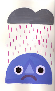
I wanted to move away from working digitally so I started a new sketchbook with doodles of kids faces, I wanted to start off by designing the character that would be the main focus of my book, so I just played around with different shapes and textures. I found that my work looked a lot more free and creative when I moved away from working digitally, which helped me come up with a lot more ideas and kind of carried me through the developmental stages.

I went through a mixture of mediums in my sketches, I started off doing all my monster designs in papercut but it was taking way too long and wasn't immediate enough for me to get my ideas down, so I started using oil pastels, which I haven't used in ages, but they were really good for getting ideas down quick but still having a really nice texture and feel to them. 


I tried using some different funky shapes, although I am bloody obsessed with that triangle nose, eye and mouth combination, I think it works really well, because I ALWAYS have trouble drawings noses, so this is the perfect solution, it's compact and just looks really pleasing on the eye.


I absolutely LOVE this guy, he's my favourite by far. He is developmental work for the Scared monster, who is very flitty and easy to scare like a fly, so I make him look bug like with his antenna and his wibbly legs. I really want to develop just this character into his own little stories and comics after the deadline, so that I can realy get stuck into it, without the stress of everything else.


OUIL603 - Urban Graphics

https://www.urbangraphic.co.uk/shop/range/toasted/
Ben suggested to me during a tutorial that I submit some of my dog card designs to Urban Graphic's toasted range of illustration, I really like some of the stuff on here:


The only problem I can see is that it's kind of hard to find the artists names on each piece of work, because it's all so lovely and I want to know who's done it! I don't think I'd be too pleased with having my work on a website and people not being able to find out it was me that did it! :(
I haven't had a reply yet, but I intend on emailing them a few more designs when I continue on with the greetings card design brief.


24/02/2016

OUIL603 - Hildurs final logo!

Look! a pretty logo!
Super pleased with this design and how both the background texture and the line work compliment each other. I think the corner could be a little darker so it's easier to read the white text, but the colour is loveelllly so I didn't want to ruin it. I've been enjoying doing this joined up swirly text stuff whenever I have to do large bits of text, I just think it makes titles and stuff a bit fancier. 
I have since tried to remake my own logo in this sort of style, textured background, nice little type, etc. etc.


For this one I made brusho and watercolour textures on tracing paper, cut them into different shapes and overlapped them to create a nifty funky background that I could draw on top of and make even better. The colours are again light, but the blocks of colour behind the text help it to stand out a lot more I think.


22/02/2016

OUIL603 - At Last


How RUUDEEEE.

This isn't finished yet but it's my entry for the Secret 7 brief for the song At Last by Etta James. I was trying to make a comment on modern dating and the fad that is dick pics and online dating, I don't know exactly what the song is about but I got romance vibes from it, and it's an old song, so it made sense to have this as the art work. I don't know if I'll actually submit this design because it doesn't really go with 

20/02/2016

OUIL603 - Anti-greetings cards


Last year I had planned on making a series of greetings cards that were kind of naughty and tongue in cheek, kind of taking the piss out of the tackiness and predictability of general greetings cards, since valentines had just gone I thought that would be the perfect time to start them, and I plan on creating more designs for different holidays, the next one being Easter. I kind of wanted to mock normal valentine's cards, hence the flowers, and have a funny juxtaposition between the cute pretty flowers and the rude text.


I wanted to keep the colour simple, so I kept to a two colour palette. I think the accent of colour in the flowers adds to the prettiness of it, and I tried to keep all the colours in a pretty similar palette so that they would compliment each other in a set.


These were probably my best recieved pieces of work, I sold them on my Etsy and made a small profit, I definitely want to make a bigger deal out of these in the future because I think they have real potential to be popular, there's a huge gap in the market for non twee, rubbish valentine's cards, and greetings cards in general, and I'd really missed making funny work, it was a pleasure to see people laugh when they saw them.


I ended up printing on matt paper, because I couldn't find a stock that was shiny on the outside but then matt on the inside that you could write on, all the paper in uni is slightly shiny on both sides, so I'll have to look into that before I sell the next run of them on Etsy.


OUIL603 - Secret 7

I wasn't too into many of the songs for this years Secret 7, but I decided to do Tama Impala's The Less I Know The Better. I don't think my designs particularly represent the song but I looked at previous artwork that Tame Impala had:


All the artwork is pretty abstract so I don't think that it really matters if it doesn't represent the song too well, I just had fun playing around with textures and cutting out shapes, landscapes are nice things to draw, so I went with that.


I'm really getting into doing collage lately, especially using brusho on tracing paper, cutting out shapes and layering them up, I think it works extra well because you get so many different outcomes and different possibilities with the layering. Using this technique on tracing paper always works well, because when you layer them up you get new textures from the ones you already have.
The bottom image is actually one of my favourite pieces of work from this year, I want to put it in my portfolio because I think it represents my favourite things about my practice, texture and the colour purple.


OUIL603 - Threadless April Fools


I entered Threadless's April Fools competition with this design, they wanted something fun and quirky that 'someone would only wear on April Fools' Being me I wondered how far they actually wanted me to go with the quirkiness, but looking at some other entries I decided to just stick with drawing funny looking dogs. 

I really like this design, mainly because I drew the dog first and used hand made textures and didn't rely solely on doing things digitally. I used this dog in my Urban Graphics brief, but illustrated on top of it and added text to make the design. I was having fun playing with textures on tracing paper that day so I decided to put some of it on top.


Here's the t-shirt mocked up on the Threadless submission mockup, I think it looks okay like this, but would have been a lot better if the design was allowed to wrap all the way round the shirt, the textured parts, because it kind of just looks plonked there when it's sat in the middle. I should have got rid of the texture and made the image more circular.

11/02/2016

OUIL603 - Book idea

It's okay to cry.

A book that reinforces a positive message about showing your emotions and that it's okay to cry sometimes.

My first idea is to have the main character as a young boy who was told that "big boys don't cry" bad things keep happening to him, he gets sad, but doesn't show any of his emotions and keeps them bottled up, so and emotions monster starts following him around and making things worse and worse, until finally he cries and becomes a super hero who has the ability to kill the monster.

My second idea is a story which tells the story of a weightlifter who cries all the time, and everyone thinks he's weak, but he somehow proves everyone wrong (I don't actually have this idea as solid as the first one) I've actually just found something quite similar to this on the Flying Eye Website.
It's a book illustrated by Keith Negley called Tough Guys Have Feelings Too.


“A simple, stylishly illustrated picture book […] This appealing book makes the timely decision to hold the conversation about male emotions while everyone involved is in costume, performing some iconically macho role.”
New York Times
“It teaches little boys that they don’t have to feel like Superman all the time.  This book may actually go a long way towards dismantling rigid gender roles.  For both men and women, crying can be considered a sign of weakness or hysteria — forcing them to repress this very natural emotional response. But Tough Guys (Have Feelings Too) wants to put an end to that right now.  This is the crying revolution, and it looks like the next generation might actually grow up knowing it’s OK to have a good cry when you need.”
Bustle
“The title says it all.  These tough guys are rendered in simple lines and shapes and colored in black and white, red, blue, and yellow, but they represent a broad range of virility. […] Negley’s debut is nonetheless sincere.”

OUIL603 - Feminism for young boys

So I'm thinking about making a series of books, aimed at young boys, explaining feminism and talking about different topics like that. There's a hueg gap in the market for feminist kind of books aimed at young boys, I could only really find one on the NoBrow website, and I think a book would help to get rid of the stigma attached to feminism, especially among men. I think that educating children on life matters like mental health and wellbeing is really important and doesn't get enough attention in schools, SO I want to make a difference by making lots of books!

http://www.scarymommy.com/raising-feminist-boys/

25 Rules for raising Feminist boys.

1. Feminism does not mean feminine. It means equality.
2. Being a boy doesn’t mean you can’t be a feminist. Neither does liking sports and burgers and action movies. Just like wearing jewelry and makeup, taking my husband’s last name and getting manicures don’t make me any less of a feminist.
3. It’s OK to cry. But as with all expressions of emotion, take care to do so in a responsible and respectful way.
4. Be friends with girls.
5. Girls can like trucks, superheroes and Stars Wars, just like boys can like princesses, tea parties and My Little Pony.
6. The phrases “like a man” and “like a girl” hold no real meaning. Ignore them.
7. Be strong AND sensitive; the two are not incompatible.
8. Your penis does not give you special privileges. It is simply part of your anatomy. It makes you human, with all of the pleasures and obligations that the human experience offers.
9. Hold doors open for women. And men, for that matter. Not because of any sexist traditions, but simply because holding the door is kind and polite. It is just good manners. For the same reason, push in your chair and put the toilet seat down.
10. A girl might look pretty, attractive, cute and sexy, but true BEAUTY comes from within.
11. Pay for dinner and buy her flowers. Not because that will make her more likely to want sex or fall in love; do it just because it is the nice thing to do. (And if I had daughters, I would also tell them to offer to pay for dinner and to buy him flowers because, again, it is a nice thing to do.)
12. Have sex when you are both ready. Not because your friends are having sex. And not because your hormones are going all haywire inside of you. But because you are physically and emotionally ready to handle sex and its aftermath.
13. “No” means no. Silence also means no. And even “maybe” means no. Only “yes” means yes.
14. Surround yourself with people who invite you to be your best self. Be wary of people who want to change you.
15. Equal work deserves equal pay; equal pay requires equal work. It’s just that simple.
16. Your gender does not define you. Neither does your job or car or bank account. Be kind and brave, be a good friend and a hard worker and treat everyone with respect — those are the qualities that will define you.
17. If you get married one day, your spouse may or may not take your last name. Neither choice has anything to do with how much she (or he) loves you.
18. There are more ways to provide for your family than financially.
19. If you should one day have a family, make your child care decisions based on one thing only: What is best for the family. Consider the financial, professional, emotional, psychological and other factors involved, all of which might change over time. Maybe you share financial obligations associated with raising a family and you both work outside of the home, then share in the household and child care obligations as well. And if you decide that one parent will stay home with the children, don’t be afraid to step up to the plate. Being a stay-at-home parent is hard but good work, regardless of its lack of a paycheck.
20. Even though most commercials and just about every sitcom on television will send messages to the contrary, men are capable of making the bed, doing the laundry, changing diapers and tending to other household chores and child-rearing tasks.
21. Don’t be afraid to apologize. It is not a sign of weakness, but a brave act of courage and strength.
22. Never take for granted the privileges you have — whether financial, educational, racial, cultural or otherwise — and continue to fight for the rights of those who do not enjoy the same privileges.
23. Be sensitive, empathetic and compassionate.
24. There may be differences between the sexes — just like there are differences between all people. This is a good. Do your best not to over-generalize. And don’t be afraid of the differences; celebrate them.
25. Remember these lessons, not necessarily because any person or group of people needs protection or special treatment, but simply because they are essential for fairness, equality and respect. They can, I hope, change the world — one small step at a time.

09/02/2016

OUIL603 - Random Stuff

To fill some time behind the stall at Thought Bubble, I decided to do some sketches and designs and then sell them for a few quid each, seeing as they didn't take me too much time, people actaully bought quite a few of these! I just drew what came into my head, so they don't really follow a specific theme.
These were alright even though they were pretty low quality quick sketches, they were fun to do and some people seemed to like them, it kind of did teach me to not just throw away my sketches, and that I should try and do something with them and when I'm stuck for ideas, I can just draw something up really quick and expand on it.