- Throughout this module I have developed many new skills and also improved many, I think my development skills have improved massively and I now find it more useful and beneficial to my work to put down all of my ideas and focus on getting them down rather than the quality of them. I think that I best applied my development skills in Brief 4 as I kept on testing backgrounds and ways of creating texture in order to best communicate my quote. I think that my time management skills are also improving, as I am finding it easier to balance my time equally between the different aspects of the course.
- I now like to focus a lot more on creating texture in an image and letting that shape my final piece. During the concept development for the Initials Brief I found that experimenting with creating different textures was very important in developing my ideas, because often the textures that I created would then lead on to me coming up with or expanding on a new idea. I found that putting down loads of mini concept ideas onto a sheet was a very effective way of coming up with enough ideas, I intend to employ this method of development more in later briefs.
- I think that the way I can easily change the way I work and create images to fit to a certain brief is a strength of mine, I don't think that I am bound by a certain 'style' and can create different types of images using different types of media and I'm not afraid to experiment or go out of my comfort zone. I think my work has become stronger since I started experimenting more with shape and texture.
- I think that because I have found a media that I like to work with, I sometimes tend to begin working with this straight away and carry on using it because I know that I can get good results with it. I intend to start using collage more as it is something I haven't experimented much with. Also I sometimes tend to get stuck onto one idea that I think works for the brief and not want to try to create more or stop developing it, for example in Brief 4 I found almost straight away the idea that I wanted to use as I couldn't think of any other ideas that I thought would fit with the brief.
- During the next briefs I intend to experiment more with collage as I think this would give me a lot of different results that I have not had before. I am also going to try and step away from an idea even if I am happy with it and think it describes the brief, as I may end up coming up with something better if I carry on generating ideas. Throughout our next brief I intend to focus more on development rather than the final outcome, I think I focussed too much on the quality of the final pieces for the previous briefs. I also need to spread my time even more equally between visual language and the briefs that we are given, as I found that I tend to prioritise too much and often leave one thing until the last minute. Finally I think that I need to focus more on ongoing evaluation during a brief, I do this mentally but I think I need to improve this by putting more of it on my blog.
18/11/2013
OUIL403 - End of Module Self Evaluation
14/11/2013
OUIL403 - Studio Brief 4 - A Matter of Opinion
My ideas for this brief centered around creating some form of character which would communicate a certain personality, and to place her in an environment which also communicated this personality, to show the idea that the way that you are shapes and changed the world you see around you.
I liked the idea of having things grow out of the top of the planet heads, but I don't think this looked 100% right.
I decided against having things floating around inside the planet, and went with the more simple idea of having things growing off of them instead.
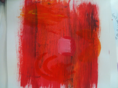
I quite liked the way the all red colour palette worked with the darker shades on top.
For my final three illustrations I chose to do three different types of characters, where their 'world' and the colour palette would reflect their personality.
OUIL403 - Studio Brief 3 - A Day in The Life - Peer Feedback and Self Evaluation
Using the feedback I received I decided to further the ideas of the characters being mindless zombies who have been taken over by the paddy power green mist, however I had to decide on a way to make the characters a little more human like, as there was some confusion as to what they actually were.
04/11/2013
OUIL403 - Studio Brief 3 - A day in the life
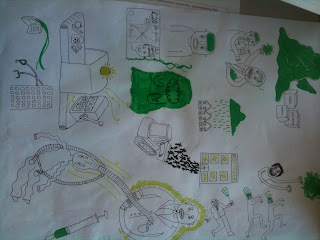
My first idea sheet had a lot of good concepts on it, like the green rain cloud and green slime, but I don't think they reflected the seriousness of the article, so I started drawing more morbid and "weird" looking ideas. I think these worked better, because they communicated the emptiness of the people who are exploited by paddy power.
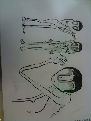
Here I was trying to make the character look a bit more human, responding to some feedback I received that people were a bit confused as to why they looked so inhuman.
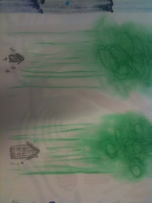
I tried to make the green, which represents paddy power, the main focus of the pieces, to communicate how the gambling addiction swallows and consumes everything.
I really like how the final pieces turned out, I think choosing to work on white card rather than grey worked best because it let the green to stand out more.
OUIL403 - Studio Brief 3 - A Day In The Life
For this task we were asked to take one concept from our ideas, mine was the "empty" character, and to communicate this using as little visual marks as possible in the set format that we had been given.
I first started drawing the full body of my character, but then decided that the torso was not needed to effectively communicate the idea of a person.
When drawing just the head and features of the person I came across some problems; the shape of the features did not fit well with the landscape format, they would either sit awkwardly in the middle or take up a small space in a corner.
When I changed the format to portrait I found it a lot easier to make the drawing more visually pleasing. Below is one idea which I thought did not work particularly well in the landscape format, which I was then asked to change into the portrait landscape. I intend to consider format a lot more now, as I now understand that it is much more effective to plan beforehand your ideas in the format you will be using, as some ideas work only in certain formats.
Subscribe to:
Comments (Atom)


