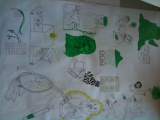
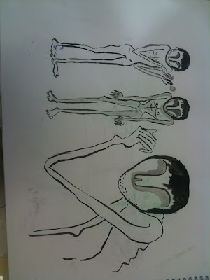
My first idea sheet had a lot of good concepts on it, like the green rain cloud and green slime, but I don't think they reflected the seriousness of the article, so I started drawing more morbid and "weird" looking ideas. I think these worked better, because they communicated the emptiness of the people who are exploited by paddy power.
Here I was trying to make the character look a bit more human, responding to some feedback I received that people were a bit confused as to why they looked so inhuman.
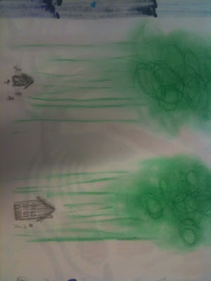
I tried to make the green, which represents paddy power, the main focus of the pieces, to communicate how the gambling addiction swallows and consumes everything.
I really like how the final pieces turned out, I think choosing to work on white card rather than grey worked best because it let the green to stand out more.


No comments:
Post a Comment