28/04/2014

OUIL406 - Visual Communication Final Evaluation


  • What skills have you developed through this brief and how effectively do you think you have applied them?

With the first brief; That's Pants, being a group project, it really helped me develop my group work skills, although the brief wasn't as successful as we would have hoped, it definitely made me realise the plus and negative sides of working in a group, and the best way to tackle it. Because I decided to use Illustrator for both brief 2 and 3, it really helped me develop my digital skills, because I had really been wanting to learn how to use programs to create better looking digital work, forcing myself to use something that I was not completely comfortable with using helped me to learn how to put my ideas onto the screen and develop them digitally.

  • What approaches to/methods of image making have you developed and how have they informed your concept development process?
Because I wanted to get more practice using it, I decided to use Illustrator for brief 3, after I quite enjoyed using it during brief 2. Because of the way that Illustrator works, I had to make my work quite bold and made up mainly of shapes to work with the vector program. I enjoyed this limitation and the way that it made me think about how I would communicate my own personal way of working on a platform that I'm not used to using. While I was developing the concept of my work I had to keep in mind that I would be working digitally, so it wouldn't be as easy to have shading and tone, so I would have to use shape to create this, I enjoyed the challenge of having to think about how my work would translate to digital and having this influence my development.
  • What strengths can you identify in your work and how have/will you capitalise on these?
I think that because I have been using Illustrator more, my skills creating digital work have greatly improved, especially in brief 3, I thought these outcomes were my best yet, not only because of the aesthetic I created working digitally but also the ability to create and maintain a colour palette and co ordinate it throughout your work to create a series, which is a lot harder to do when working non-digitally. I intend to capitalise on these by continuing to work digitally to further improve my work and help me to become more comfortable working digitally. I also want to start developing work and testing out ideas using Illustrator instead of hand drawing it, because I think it'd be easier to then translate this into finished pieces.

  • What weaknesses can you identify in your work and how will you address these in the future?
I noticed a couple of weaknesses in brief 3, I was happy with the way that my postcards and stamps turned out but then I had trouble creating a final A2 poster that I was happy with. I knew what I wanted to include in the poster but I found it difficult to plan out and make a composition that I was happy with, as I'm not really used to working at such a large scale with such a specific subject matter. I think that the best way to address these problems I am having with large scale composition would be to practice scaling up smaller work and also taking more time to plan out future large pieces of work. I think that working digitally will also help me with this, especially when using vectors, because it is easier to scale work up, while still keeping the same amount of quality and detail.

  • Identify 5 things that you will do differently next time and what you expect to gain from doing these?
  1. I intend to be a bit more adventurous with my final outcomes, I want to employ different ways of working, like more etching and screen printing, and also trying out Risograph printing, as I think this will help to identify and follow a stronger direction that I want my work to take.
  2. I will again keep pushing myself to focus more on development work, although I think I have done this well in brief 3, I intend to keep working at it and producing more to help influence my final outcomes.
  3. I will work harder to incorporate things that I have learnt from different modules, like skills from Visual Language into my work so that I can continue to find new and interesting ways of working that work well for me
  4. I also want to try and communicate more of myself into my work; more of my opinions, things I like and dislike and more of my humour, as I think this has worked well where I have employed it in previous briefs.
  5. Finally I intend on planning my time more, although I finished the last brief in good time, I want to carry on doing this and keep creating lists and start making more timetables to help me manage my time.
  • How would you grade yourself on the following areas?
Attendance - 5
Punctuality - 5
Motivation - 4 (leaning towards 3 closing to the end)
Commitment - 4
Quantity of work produced - 3
Quality of work produced - 4
Contribution to the group - 5

OUIL406 - Persons of note - A2 Poster and Final Crit


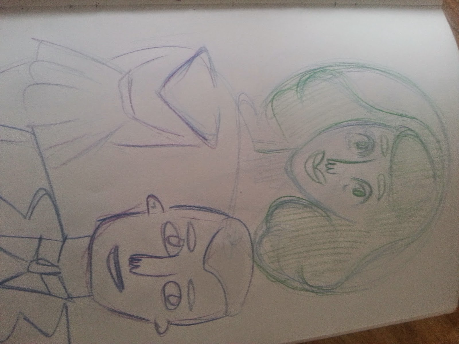
When I first started thinking about the A2 poster, I knew that I wanted to have a realistic ish portrait of Einstein as the main focus of the image, I just didn't really know how I would do it. I also knew that I wanted to carry on with the colour scheme of blues and purples that I had used in the stamps and postcards, so I started sketching using these colours.


My first attempt I worked on top of a light box and tried to create the same shadows and highlights in the print out picture using the coloured pencils. It looked okay when I was doing over the light box, but once I took it away it looked very patchy and not at all how I wanted it to look.
So I just started sketching using a reference image of Einstein so I could do my own personal take on the portrait.


After I had completed my final sketch of Einstein I scanned it in and worked in Photoshop to erase the background and create a new one using the same sort of triangle shapes of brusho background I made. I wanted to do this as to try and carry some of the themes from the other pieces of work into this, so that I was creating pieces of work that were obviously a series. I initially intended to use the image on the right as the final piece, but I wasn't really happy with the way it looked. I thought that it looked very empty and bare compared to my other bits of work. So I played around with the same technique I had used when making the stamps, of playing around with text and changing the opacity.
I used one of Einstein's famous quotes 'Play is the highest form of research' as the text that I overlayed ontop of the original image, as this was one of the quotes I had used to inspire the earlier development work.
I am much more pleased with this final image than the one before as I think it works better as a poster, I think the two elements of the portrait in the background and the faint text layered on top work well, because you have to focus on the image to look at the two different elements of it.


At the final crit it was said that the visual quality of my work was excellent, but the type needed more thought. I agreed with this however I didn't really want to change the font, because it was similar to the font I used in the stamps, which I though helped to create a better set.
It was also said that I've tried a lot of concepts, which can get a bit confusing which i also agree with, I think If I were to do this brief again I would maybe maybe the postcards a bit simpler as I don't know if they properly communicate the quote,


19/04/2014

OUIL404 - Visual Language Final Evaluation


  • Which practical skills and methodologies have you developed within this module and how effectively do you think you are applying them within your own practice?

 I found that this module has helped me the  most throughout the year, I think that without this module my practice would not have improved as much as it has. Each visual language session taught me something that I found to be extremely useful even if I did not fully understand how to apply it properly to my work. I found that I have most effectively started applying composition, viewpoint and depth to my work. I now feel myself considering these things a lot more when planning out and sketching work, which is not something I would do before, I find that it is helping my work look a lot more well put together and thought out, understanding composition and combining it with the other aspects of this module that we have learnt really does help your work to visually improve and I can definitely see a drastic change between my work now and my work from the start of the year.


  • Which principles/theories of image making have you found most valuable during this module and how effectively do you think you are employing these within your own practice
Alongside composition and the other points I mentioned in the last answer, I have found the different ways that we have been taught of how to create an image, like how to use shape and texture, very valuable. I find myself being able to use different methods of image making than I have before, using shapes and textures that are not exactly true to life but communicate something more and create a more visually pleasing image. This module and the different sessions we have been taught have helped me to develop my skills in testing and playing around with how I make pictures, I think this is one of the most valuable things that I am applying to my work, because if I were not able to play around and experiment then my work would not improve.

  • What strengths can you identify within your Visual Language submission and how will you capitalise on these?
I think the main strength in my submission is just the amount I have improved over the year we have been having the sessions, looking back on my work and the work I submitted for the first couple of briefs, I can see how I would have done them differently to come out with a much better finished image. I think one of the other strengths I have noticed is how I am learning to better use composition to create a strong piece of illustration, I think my work is beginning to look a lot more professional and learning these different techniques is definitely helping me to identify what directions I want my work to take.

  • What areas for development can you identify within your Visual Language submission and how will you address these in the future?
I think I am still struggling a little bit with exploring loads of ideas, although I know that in the real world, you wouldn't necessarily have to do 5 or 6 variations of the same idea to come up with a finished image but for the purposes of developing and becoming better I know that I should keep trying to do more development of the ideas that I don't think I would continue with, rather than just developing an idea that I think works best. 

  • In what way has this module informed how you deconstruct and analyse artwork, whether your own or that of contemporary practitioners?
Learning and starting to understand all of the things we have been taught throughout this module has helped me learn how to reflect on the different elements of my work when I am evaluating it and has allowed me to ask more questions in order to improve my work throughout the development periods of each brief'; I ask myself questions about the composition and how I can change it, whether the colour palette is right and balanced correctly and how I can add more depth to my image. Now when I am looking at contemporary illustrators for inspiration I can pin point exactly what it is about the image that I like, whether it be the composition and the way they make marks and create texture, where as before I found it hard to describe what I like, which in turn made it hard for me to incorporate this into my own work in my own personal way.


  • How would you grade yourself on the following areas?
Attendance - 4
Punctuality - 5
Motivation - 3
Commitment - 4
Quantity of work produced - 4
Quality of work produced - 4
Contribution to the group - 5


15/04/2014

OUIL404 - Colour, Value and Notan

For this brief I decided I wanted to use the subject of Film Noir Femme Fatale's as I thought the dark contrasting colour palettes used in those would be perfect for demonstrating colour, value and notan.


I originally thought that I would use Quink to make my final image, because it is easy to create different values of colour, and I wanted to work in black and white anyway to reflect the film noir look. I thought about adding coloured pencil to highlight certain parts of the image so I tested how well pencil worked on top of dried Quink, althought it worked you couldn't achieve very vivid colours with the pencil on top of the ink.


To begin with I just messed around with the way I wanted to main figure to look and the object in the composition would be the cigarette. I started to test where I would place the cigarette and how I would include the best contrast of value with the different tones of black and grey.


Here I was playing around with using both the quink and watercolour pencils to get a mixture of colour, but I much preferred the black and white as it was hard to get the watercolour pencils dark enough.


Finally I decided I would have her holding the cigarette rather than it being in her mouth, as it was easier to place the smoke in the image and have in contrasting against the dark background. I wanted the smoke and the cigarette to stand out most against the dark so I used all pencil instead of the Quink to get a darker and more even tone.


Overall I am happy with the finished image although I think it would have been better if I had use charcoal or something that would create a much smoother colour rather than the pencil, although I do like the texture it creates.


14/04/2014

OUIL404 - Frame

I didn't really understand this brief as I don't really understand the difference between frame and composition, as it seems like it is just a combination of the two.
I just did a few sketches trying to incorporate all elements, the elephant, the butterfly and me and think mainly about composition and how I would overlap everything and their sizes. 


I didn't really like any of the sketches that I did, the one I carried on with was the most successful I think, and again I really didn't think the end result looked very nice, especially in monochrome. So after I had finished what was originally going to be my finished piece I took it into Illustrator to get a much cleaner look.


I was more happy with this final image, I used the kind of stain glass shape look that Ive been using in previous work because I think it makes simply images look a lot more interesting.


12/04/2014

OUIL404 - Viewpoint and Depth


For the viewpoint and depth brief I thought an interesting way to include both viewpoint and depth would be to illustrate using figures, because you can very easily communicate depth through the size and scale of the figures in relation to one another. 


To make it easy to etch the image I kept the line simple, but added marks in order to create an interesting texture. Although after I completed the etching I realised that I could have added more detail as the actual process of etching wasn't as complicated as I thought it would be.


I am pleased with the overall finished piece even though I missed out a couple of bits in the image. I really enjoyed etching especially after I realised how easy it is and how simple the process is. I would like to do some more etching later on that has more detail and possibly is larger. If I were to do this piece again I would probably add more detail and maybe some background texture. I tried to get the foreground to be darker than the background by exposing the plate for different lengths of time, although this didn't work very well.


07/04/2014

OUIL406 - Person of Note - Postcards

For the four postcards I was originally going to a sequential series of images that would illustrate one of Einstein's theories of time travel, they would work as a series and were not intended to work as singular stand alone images. 


Because the idea of the postcard is that it is supposed to communicate what Einstein was about in one single image that can be interpreted by itself without any other images to explain it. So I decided to try something else and think of a series of images that could work on their own as well as in a set.


I started by sketching some time related objects, I wanted to draw these and mix them with some space imagery, I thought that that could communicate the idea of space and time in one single image rather than a comic style sequence. 

After some initial sketching I decided that I wanted to create a more complex image, with more detail than just and object, so I came up with another idea of showing people reading in different scenarios, I thought that this would kind of represent one of Einstein's famous quotes, that play is the highest form of research.


I wanted to include the idea of using the space texture in shapes that I had used in the stamps, I thought  that this was a more visually interesting way of including the texture rather than just having a solid block of it.


I added a grain texture in Photoshop after I had finished the initial vector drawing in Illustrator, I'm really enjoying using Illustrator, I think the bold and quite simple shapes you can create in Illustrator really suite the way I like to work. I thought the image looked better with the grain texture, so that the colour wasn't as flat and boring.