I don't think the collaboration worked at all, apart from sharing ideas at the start because not all members of the group put in the sam amount of effort and the majority of the research work ended up being done by me. Not everyone was in the studio at the same time so it was quite hard to get everyone together to discuss ideas and decide on a final solution. Because the group was hardly together I felt like I had to do all the work so that we didn't end up with nothing.
What specific visual skills did you have to offer in relation to your chosen brief? How did you use them? How did this benefit the project?
I think I'm quite good with creating background textures, and also creating good looking type. This helped us to create the stickers and make them as bold and simple as possible. I think the way I draw things lends itself quite nicely to looking bold and easy to understand and recognise from a distance.
What specific non-visual skills did you have to offer in relation to your chosen brief? How did you use them? How did this benefit the project?
I think that I definitely helped the group to organise things and made sure it got done, because a few of our group members were quite passive and didn't come into the studio very much, if I hadn't taken charge and motivated the group and made decisions for everyone, including doing all the work, then nothing would have got done.
What were your specific roles in the collaboration in relation to your chosen brief? How well do you feel you fulfilled them?
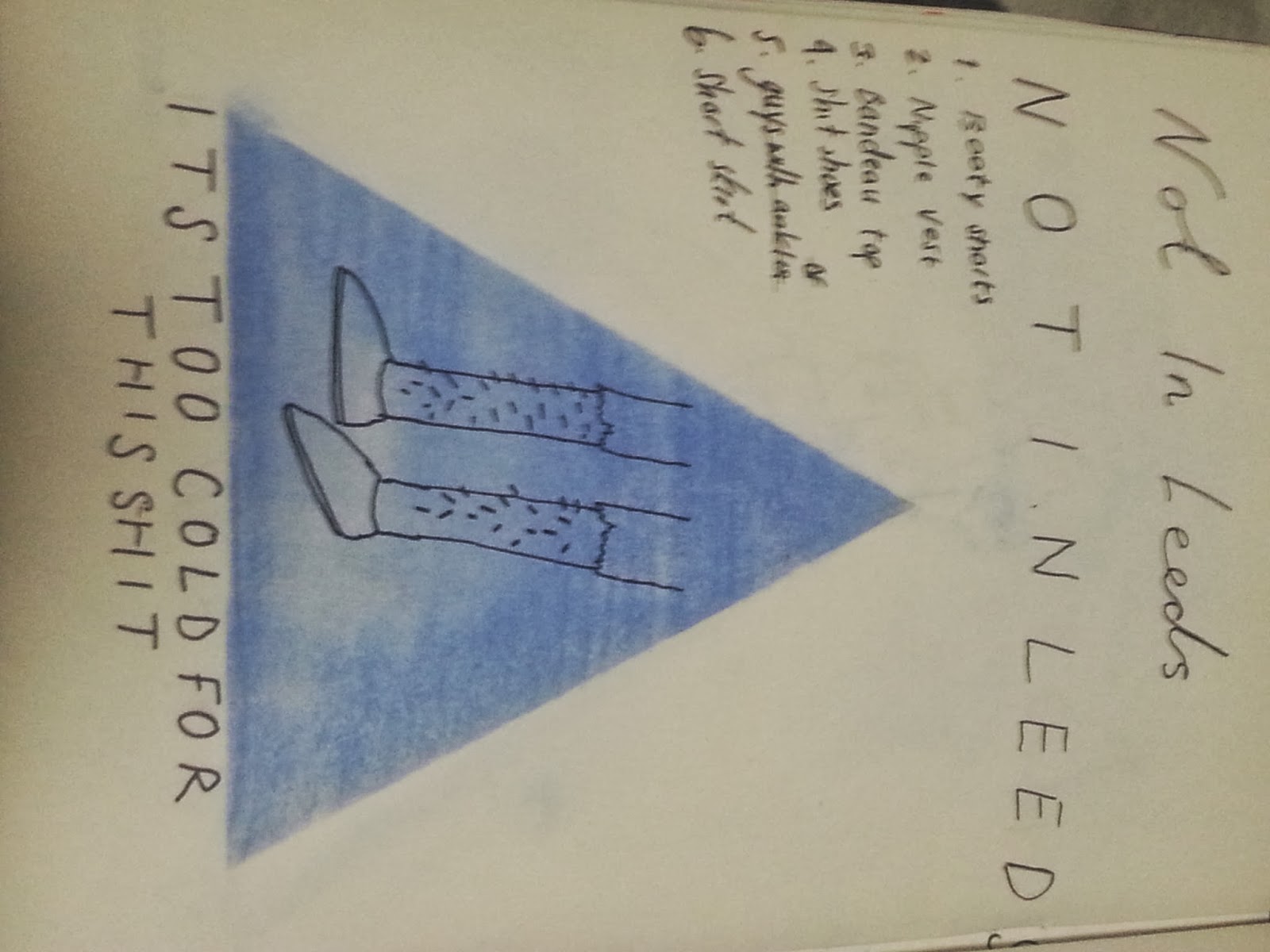
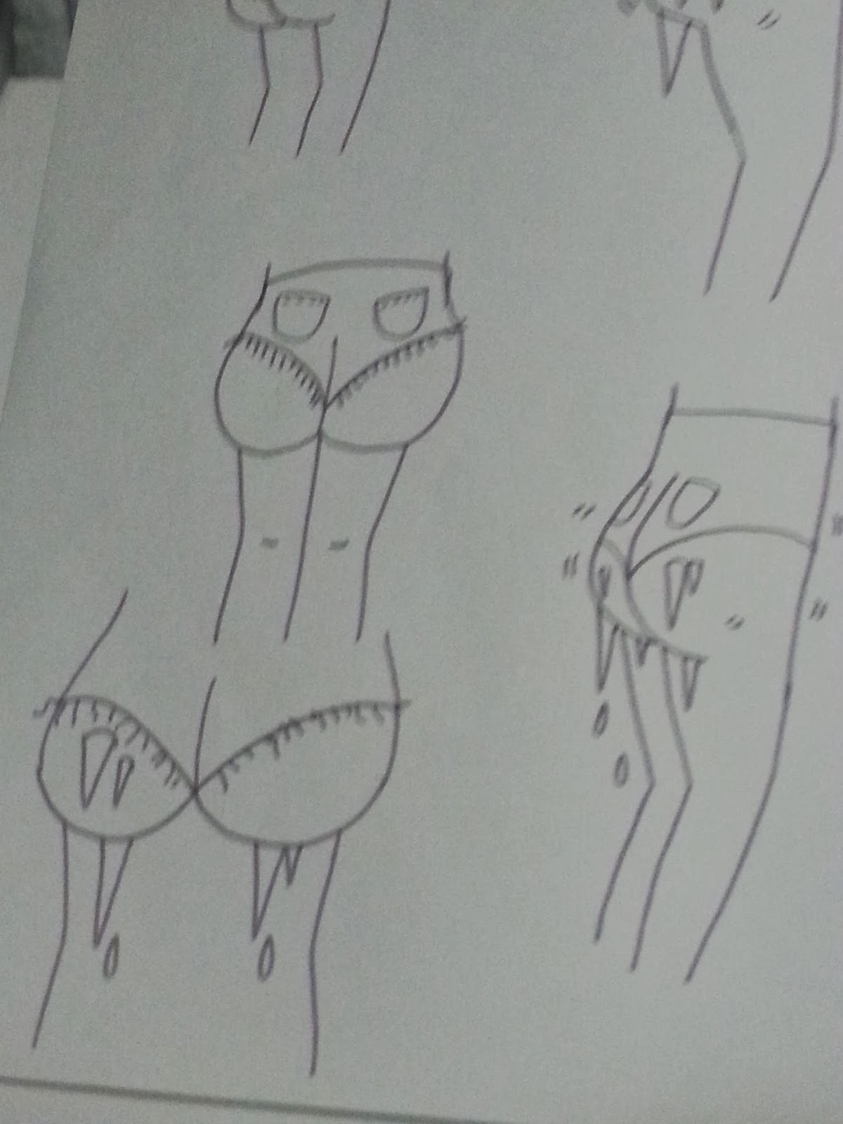
I think that even though we were meant to share all the roles and do equal amounts of work I feel like I took part in all roles. I did all the development work in relation to research and developing visual ideas for the stickers, I also made the template for the final sticker designs for people to place their own work into. I feel like I organised the group through the group chat on facebook and made sure that everyone did the work they were meant to do.
What were your individual responsibilities in relation to your brief? How well do you feel you fulfilled them?
As I said in the above question, we were meant to spread the responsibilities equally but this didn't happen. I feel like the rest of the group didn't have any responsibilities apart from making their own version of the design to go in the sticker.
How do you think you benefitted from collaborating with others?
I don't think I benefitted at all from it, apart from realising that you can't rely on other people to work hard and do what they are supposed to do. the only positive side of working collaboratively is the combination of everyones ideas. I think I would probably refuse to do another collaboration brief.
What would you do differently when collaborating next time?
I would say no, I'm not working with other people. Then if I was threatened with death, which would be the only way I would work collaboratively again, I would probably be more threatening towards other members of the group to make them do research and actual work rather than leave all to me to do. I would refuse to all of the work so that others were forced to actually do something.


