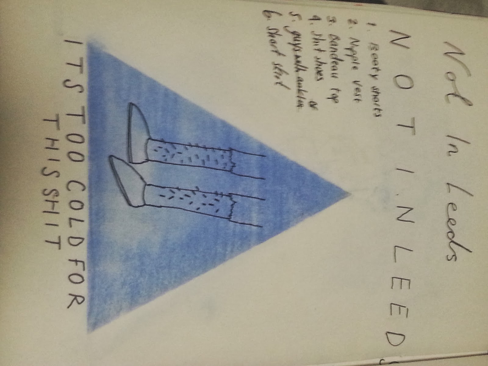
After we had decided on a font that was both bold and easy to read and also looked 'hipster' enough, like the posters I had researched, I drew up a couple of possible layouts for the text and shape where the image would be placed. I think that spacing the text evenly underneath the triangle follows the look we were trying to achieve.
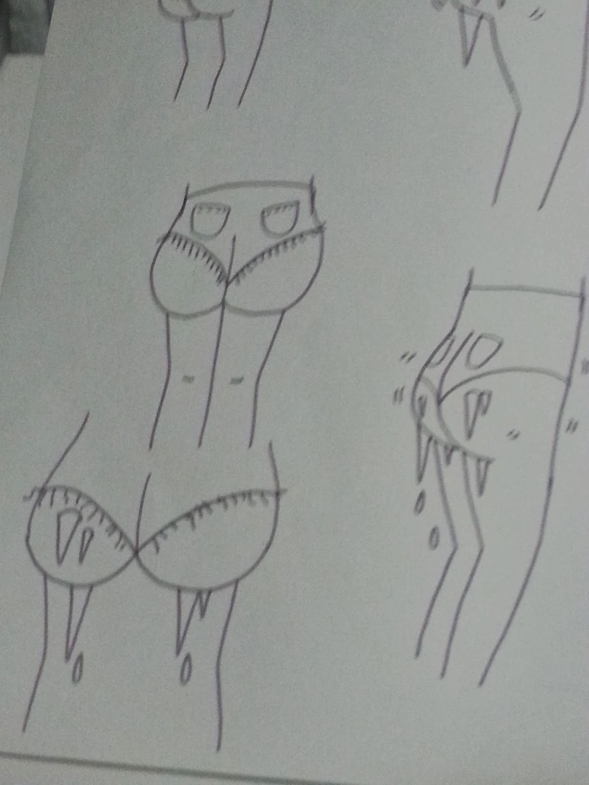
When I was experimenting with different ideas for the shit shoes sticker, I thought that it would be more effective in putting the idea of shit shoes across more effectively if I made the design as minimal as possible and got rid of the leg drawing and focussed on just the shoes. I tried drawing the legs and shoes in different perspectives and from different viewpoints in order to see which view was most effective.
I found that once I started looking at real life references to help me draw, my ideas became much more easy to recognise and guess what they were supposed to depict straight away.
Here I was trying different textures to see how I could make the image stand out against the blue background of the triangle. The black shirt on the right made me decide I wanted to use quink because it was dark enough to stand out but also had different tones in it to give it texture.
On the final designs I accented parts with a white pen to create a contrast and simple detail to make the designs more interesting but minimal at the same time.


No comments:
Post a Comment