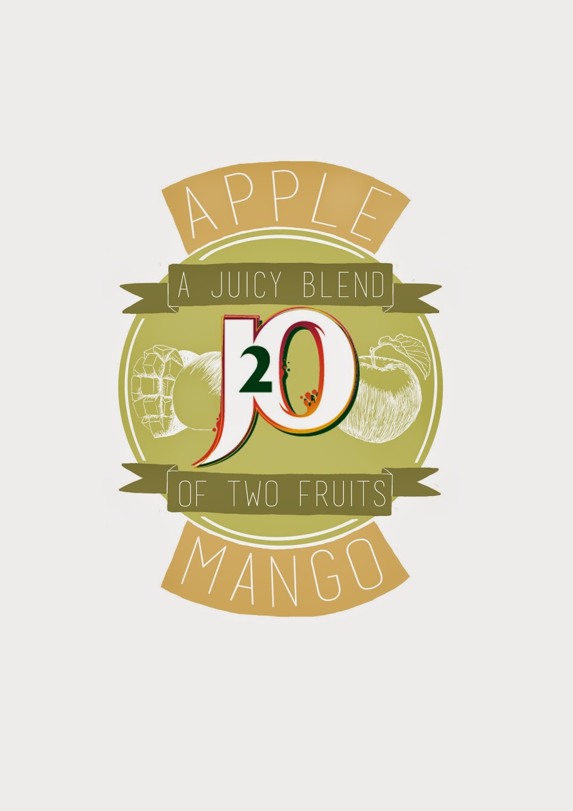
I began just testing ideas using actual fonts rather than hand drawn ones, although I think that some of them work, I think that I should go back to using more simple colour schemes, such as just black and white. I like using white text against a brightly coloured background, I think it's a more 'adult' way of adding colour, because although J2O said that their existing products were seen as tacky because they were brightly coloured, I think that if done well, colour can add to a design rather than make it seem tacky.


No comments:
Post a Comment