30/10/2013

OUIL404 - Study Task 3 - Line and Mark making

For this task we were asked to choose a visual subject to research and explore through line drawing. We have to work in monochrome and use a minimum of 10 different tools to product 3 drawings per tool.
The subject I chose was deep sea diving, because I find the weird looking fish you find at the bottom of the sea really visually interesting. Below are a few examples of some of my sketches, I started out by using just sharpie, but I wanted to try something more delicate to get the intricate detail of the fish. Using pencil I found that I could create a nice contrast between thick and thin lines to create depth, however the line quality did not vary and wasn't very interesting. I then tried experimenting with charcoal, but again I found that it was hard to get the high level of detail that I wanted to include in the sketches, however charcoal was good for getting a nice gradient of colour. I then started using white on top of black sharpie, which I particularly liked the effect it gave, especially when the background black is not one block colour but slightly textured.


Finally I started using ink and water, I think this worked very well when trying to suggest the shape and form of jellyfish because I think it suggests movement. Overall my favourite method of working that I experimented with was using ink a water, I think dotting the ink and letting it run to create a texture and then working over the top of that created a nice contrast between line quality.


29/10/2013

OUIL403 - Studio Brief 2 - Your Initial Brief (Photoshop)

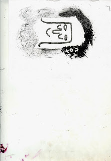
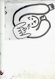
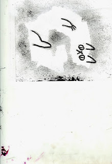
During this workshop I used the skills that I have learnt throughout the past 3 weeks to create 5 finished manipulated images from the scans of my work. Below are the original scans:


I used the transform and crop tool to make the scanned image central and then cleaned up any marks I did not want with the eraser tool. To make the lines darker I messed around with the levels, I tried to make the lines as dark as possible and the background as white as possible.


 These are my final manipulated images. In the top one I used a smoke texture to imitate the cats fur, I think that using textures that aren't from the actual thing (smoke for cats fur instead of actual fur) is most effective because it creates quite an interesting image which isn't obvious straight away, I enjoyed using a mixture of textures and the paint tool in the same image.

28/10/2013

Studio Brief 2 - Your Initial Brief - Photoshop Development

During the Photoshop workshop we learnt how to use the different tools to create a clean and usable image from a scan. We scanned some of our own images from the Visual Narrative brief and cleaned them up using the healing brush tool. To get the final image as crisp as possible I played around with the levels in order to get the black as dark as possible.

At first I was going to use the first scanned image shown below, however after I had cleaned it up I found it was still too busy and not simple enough for our next workshop, as we would be adding textures and playing around with the tools to create a more complex image.

We also used some other images which were distorted by the angle the photo had been taken at, we used the perspective tool to manipulate it so that it was as straight as possible.


23/10/2013

OUIL404 - Visual Language - Reference and seeing visual information

Below are my final pieces following the previous visual language brief where we were asked to collect 4 different types of images and then to go on to experiment with different types of media by responding to the images we had collected.

For the portrait image I first started using ink and charcoal, because I thought it would be easiest to achieve a similar variation in tone using these. I found that whilst it was a very fun media to use and gave some really nice results, I think that it was sometimes quite hard to control, so you could not create a very clean line with it. I was given some feedback on this initial sketch and was told that the way I had used simple dots of ink to represent her freckles rather than copy them exactly was very effective, because it didn't have to be exactly the same as the original to communicate what it originally was.


I then went on to use just charcoal, and although I did not get the composition or the shape of the face 100% correct, I think that using just charcoal helped me to get a more softer look the lines, although it was quite hard to do the eyes, as you can't get very intricate detail whilst using charcoal.


For the final portrait sketch I decided to focus just on the facial features, I decided to use a combination of ink and pencil, so I could use the ink to represent the darkest shadows in the image, and use the pencil to get the more close up detail in her face. I think this one was the most successful because it combined the good elements from the previous two, the versatility of the ink and the flowing lines that it gives, and also the detail which pencils can give you, which using charcoal lacks.


For the first figure sketch I wanted to just get the general shape and look of the two figures into the image, so I decided to use charcoal. I did a quick blocky sketch which allowed me to get a sense of the placing and proportions of the figures. However, again it was quite hard to get the detail of the folds in the fabric into the image.

Here I used just a simple fine line pen. I started to look more at the folds and creases in the clothes and how they related to the shape of the body and where they appeared. Using the fine pen allowed me to get a thin and precise line, although I didn't want the sketch to be too realistic, as it was again only meant to represent what was in the original photo.

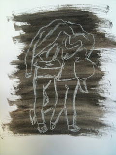
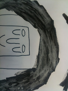
As the photo itself was quite dark I decided to experiment with using a light tool on top of a dark background, I went with an ink was background, that had been slightly diluted to give it a gradient effect and chalk on top, which is quite similar to charcoal in the way that it is hard to get detail but gives a nice texture.


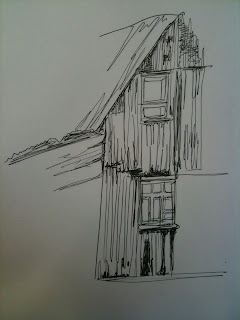
Here I am just playing around with trying to create the lines we see in the original photo. Obviously using charcoal would not give the tiny and intricate line detail, but it would allow me to experiment with trying to create lines that would just represent the original, rather than recreate them. I particularly liked the texture created on the roof, from dragging the charcoal along on its' side.


For the second sketch I wanted to do something completely different form the last, so I decided to use a pencil to look closely at sections of detail within the photo. I think this was a particularly interesting image to draw, because of the wide variety of shadowing and tone. Although I think this drawing was successful I wanted to do something a bit more abstract, yet still include the same amount of detail.


This one is my favourite of the three images, because it has a lot of the detail in it from the photo, however it only uses gestural lines to suggest the detail rather than copying it exactly. Like my feedback from the portrait sketches, I do agree that it is better to use a certain media to convey something.

18/10/2013

OUIL403 - Studio Brief 1 - Your Initial Brief - Part 3

Below are 5 illustrations that I chose from my idea sheet's which I thought were the most successful in answering the brief and could go on to be developed the furthest. I chose these particular images because I thought that they were the most simple yet effective ideas. Some of them were ideas that I came up with earlier on, where I was focusing on trying to make the whole image out of the letter form, some are later ideas where I decided to focus more on the message the image was communicating rather than the initials themselves.

I then chose one idea to elaborate on which I would use to create my final piece. I chose this image because although it didn't initially have the letters incorporated into the image, I think it expressed the idea behind the illustration itself far better than any of the others did, and I would work the letters into the image later on. Below are some pages from my sketchbook where I am testing out different textures and media to use in the final work. I wanted to carry on using the dry ink method because I think it created a nice contrast between the bright white paper and the dark ink.

I also tried using chalk on top of the ink to see what texture and colour that would create, however I think that with the white pen on top, it became too light and lost the contrast that just pure ink had. Incorporating the initials into the image was quite easy and I think doing it this subtle way was much more effective than making the whole image out of the letter. I tried using both chalk and white pen on top of the ink, however the white pen worked best because the letters were much more defined, and again created more contrast.


This is my final A2 piece, overall I'm pleased with the way it turned out and I think that the methods and media I decided to use gave me the best possible outcome. If I were to do this brief again I would have chosen to do a more elaborate design as I finished mine quite quickly, however I also think that the simpleness of the design benefited it, in that it was simple and straight to the point. On a big scale I did find it hard to create the same grey tones with the dry ink at the bottom of the piece, because I found that the brush I used was to small and would become too dry too quickly.


12/10/2013

OUIL404 - Visual Language - Sketchbooks

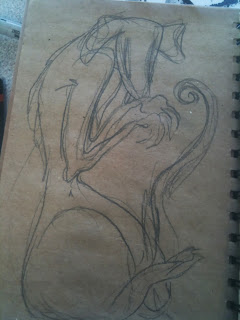
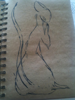
I did these sketches quickly when I was waiting for a train, I enjoy drawing rats because of the way their body proportions can be morphed and exaggerated to play on the stereotypes that surround rats, that they are evil and disease ridden. One of the reasons I like rats is because of the stigma that surrounds them, even though they are the complete opposite. Below are some sketches where I begin using a different media, a brush pen, to see how it would change the way the drawings came out. 

I found that by using a brush pen that the lines became much more fluid and soft, so I began drawing something much more feminine rather than the evil jagged looking ones which I used charcoal and pencil for. I think the poses I ended up drawing are quite human like, giving the animal personality. I was told I should develop more of a character, rather than just drawing the rats I should consider what they are doing, or what they would be thinking. I should make conscious decisions about drawing them before I do, in order to convey more of a message and make them more though provoking.