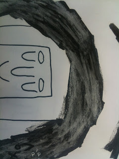
I then chose one idea to elaborate on which I would use to create my final piece. I chose this image because although it didn't initially have the letters incorporated into the image, I think it expressed the idea behind the illustration itself far better than any of the others did, and I would work the letters into the image later on. Below are some pages from my sketchbook where I am testing out different textures and media to use in the final work. I wanted to carry on using the dry ink method because I think it created a nice contrast between the bright white paper and the dark ink.
I also tried using chalk on top of the ink to see what texture and colour that would create, however I think that with the white pen on top, it became too light and lost the contrast that just pure ink had. Incorporating the initials into the image was quite easy and I think doing it this subtle way was much more effective than making the whole image out of the letter. I tried using both chalk and white pen on top of the ink, however the white pen worked best because the letters were much more defined, and again created more contrast.
This is my final A2 piece, overall I'm pleased with the way it turned out and I think that the methods and media I decided to use gave me the best possible outcome. If I were to do this brief again I would have chosen to do a more elaborate design as I finished mine quite quickly, however I also think that the simpleness of the design benefited it, in that it was simple and straight to the point. On a big scale I did find it hard to create the same grey tones with the dry ink at the bottom of the piece, because I found that the brush I used was to small and would become too dry too quickly.


No comments:
Post a Comment