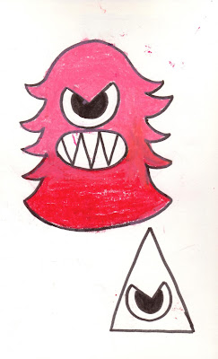
I thought it was funny how changing something as simple as the position of a characters arms can change how the character is percieved; I drew a few different variations of Angry Monster, with his arms both up and down, and I found that the ones where he had his arms up looked a lot angrier and menacing than the other designs.
I think my favourite part of the design is the bold colour, even though I will probably change it to fit with the colour scheme of the other monsters, which is more pastel, but red, black and white is one of my favourite colour combinations, because it's so bold and in your face.


No comments:
Post a Comment