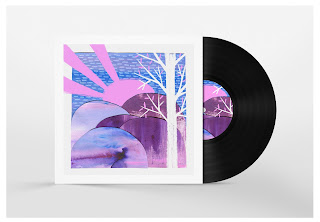
Mocked up onto vinyl covers these actually look great! I don't know why none of them got picked :( My favourite one is still the collage lady in the middle, I think the circular shape works good against the square format, and works with the composition of the image, and the circles going into the centre of the design, her face in the middle kind of makes a vanishing point which really stands out.
The bold colours of all the designs make them work nicely as a trio, I think the first two look good on there own, but that's because they were made using the same technique both times.
If I were to do this brief again I would probably make a larger range of images, using all the same process, like papercut, I think this would make a nice portfolio set and could be applied onto shirts and prints too.


No comments:
Post a Comment